Intro
In this post, I’ll describe a group project that was involved in, forecasting visitation to US National Parks, as part of my class in time series (STAT 626 at Texas A&M). I want to specifically focus on the web app that I wrote for the project using the Shiny framework from RStudio, since it was the first (useful) one that I’ve written! Of course, the purpose of it all is the modeling and forecasting, so at the end, I’ll share some of our results and interesting observations that can be made with the app.
Shiny app: National Parks visitation forecasts at shinyapps.io
Project description
The final project for this class involved applying the methods that we learned to a real dataset of our choice. Our group chose to model monthly recreation visits to US National Parks using data from 1979-2021 made available by the National Park Service Integrated Resource Management Applications (IRMA) Portal. The data are highly seasonal as one might expect, and the COVID-19 pandemic had a large effect on the 2020 numbers.
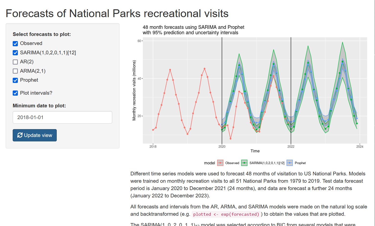
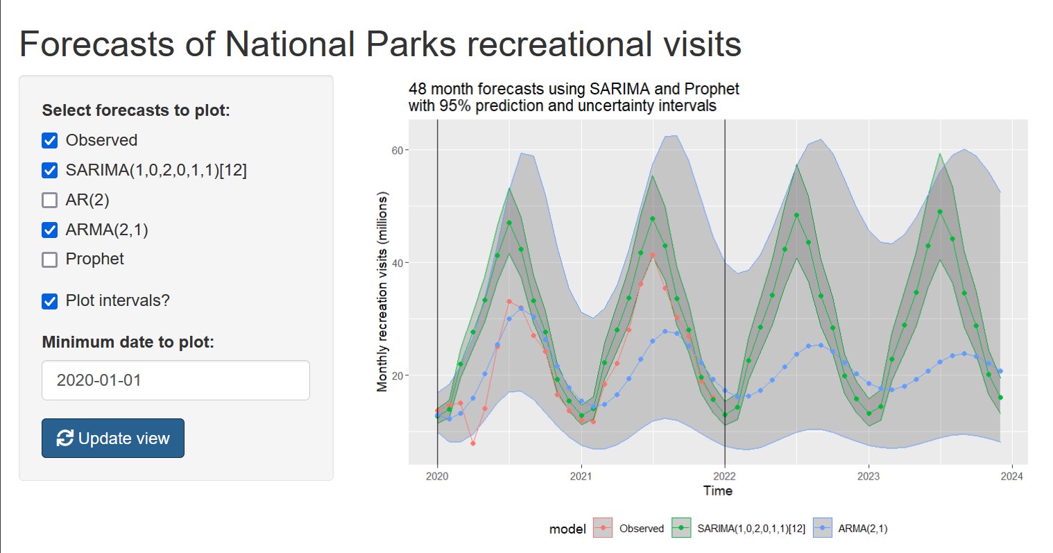
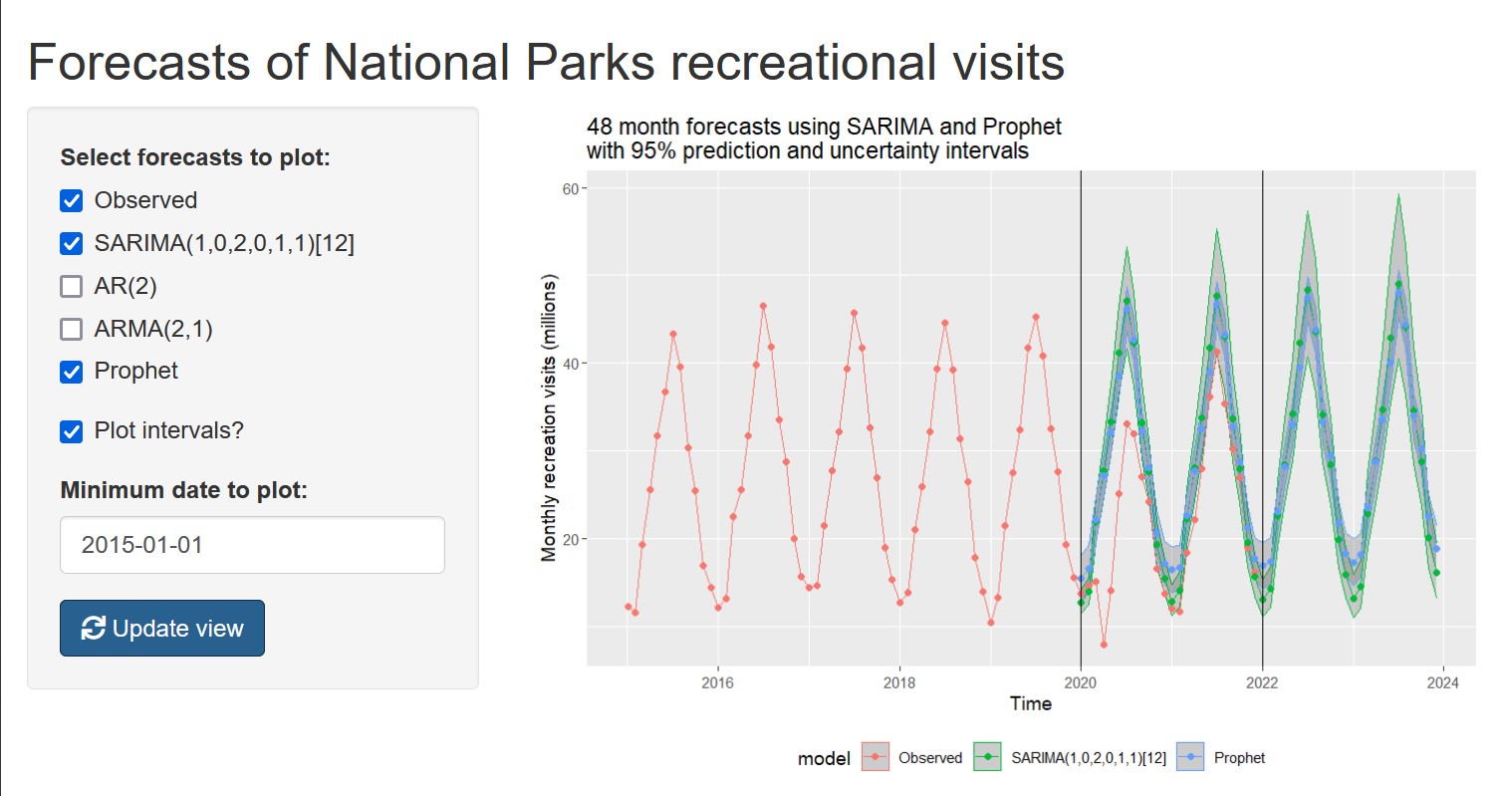
By the end of our project, we produced 48-month forecasts for all of the models that we considered and wanted to compare them, quantitatively and visually. Since we had 4 different forecasts with prediction intervals to plot, along with an observed training set ranging back 40 years, I wanted to be able to easily change what was included on the plot to make different comparisons.
Why not app?
To achieve that, I wrote the plotting code so that the output could be controlled with just a few variables. Once I did that, I realized it wouldn’t be much more work to convert this into a Shiny app!
The options to consider were:
- which of the five time series to plot (observed data plus forecasts from: one AR model, one ARMA model, one SARIMA1 model, and Facebook’s Prophet model)
- whether or not to plot prediction intervals
- how far back to plot the true observed data (“zoom in/out”)
Once I read through the Shiny documentation, it was pretty simple to set these up as:
checkboxGroupInput()checkboxInput()dateInput()
My overall impression of using Shiny was that it was very easy to create this simple app using my existing R code. Sure, there are some quirks to learn (like reactive data), and I am sure larger apps would need more optimization. But, the point I want to make is that you don’t need to do anything else but write R code. If you can do that, you should give it a go!
Some other things I learned:
- My first round of errors involved me… foolishly forgetting to retrieve the option values from the
inputlist, instead of the plain variable names that they had in the standalone script. 😄 Now that I think about it, if I am writing a script in the future that I might turn into a Shiny app, I could just use a list calledinputfrom the beginning, since that would make it easier to port the code into Shiny. - It is such a relief to be able to set options like
minandmaxfordateInput()(and other input types), since that automatically removes possible invalid inputs and thus errors that need to be handled. - I originally got a proof of concept working by reproducing all of the model building in the first part of the app script (before the UI and Server parts). I switched to producing the data separately, saving it to an
.Rdatafile, and loading that in the Shiny script. I’ll have to think about optimizing/automating this for future apps, since right now I just manually managed the process when the models were being finalized during the end of our project. - After playing with a first version, I decided to add an
actionButton()so that the plot would wait to update, rather than automatically updating every time an option was changed. - I used
includeHTML()to write the description as raw HTML in a separate file, which is much more convenient (for text longer than a couple sentences) than writing it in theapp.Rfile.
Hosting
Once all that was done, it was really easy to get the app set up on shinyapps.io! I started with the free tier, which should be enough for just sharing it with my classmates. Beyond that, it seems like the free resources might run out kind of quickly, so if I want to host more apps and/or attract a large audience, I would probably need to get a paid plan.
I would also consider self-hosting the Shiny Server backend software, but I’m not sure how much more punishment my rinky-dink €5/month Hetzner VPS can take!
Results and discussion
- Overall, there has been a slightly positive trend in visitation from 2010 to 2019, and the SARIMA and Prophet models continue this trend in the 2020-2023 forecasts.
- The ARMA(2, 1) model appears to somehow predict the decrease in visitation due to COVID-19 in 2020! Unfortunately, this is due to a characteristic behavior of ARMA forecasts in which they eventually approach their mean. The model does not predict the COVID-19 pandemic.
- Notice that the ARMA(2, 1) forecast is nowhere near as close to the 2021 test data as the SARIMA or Prophet models.
- And the prediction intervals for the ARMA(2, 1) model are huge.
- The forecasts from the SARIMA and Prophet models are fairly close, although the Prophet model forecasts higher visitation in the winter months.
- We believe this is due to the last 2 years of the training period having lower winter visitation than past years, and so the 2nd-order seasonal moving average term emphasizes this behavior in the forecasts.
- On the other hand, the Prophet model is fitting the larger series as a whole, and so generally forecasts increases for all months.
- The SARIMA model forecast prediction intervals get noticeably wider later in the forecast, whereas the width increase of the Prophet uncertainty intervals is less noticeable.
- The uncertainty intervals of the Prophet model are narrower than the prediction intervals of the SARIMA model.
Conclusion
The SARIMA and Prophet models generated similar forecasts, and we can use those to compare to future numbers to see if visitation is approaching that implied by pre-COVID data. Additional methods could be used to improved these forecasts, such as adding extra regressors to the SARIMA and Prophet models, or exploring whether a logistic growth model would be more appropriate. Compiling forecasts into a web app like this makes it easy for analysts to find conclusions by combining all the possible views, and for decision-makers to access the final results of the analysis.
Footnotes
-
AR = autoregressive; ARMA = autoregressive moving average; SARIMA = seasonal autoregressive integrated moving average ↩︎